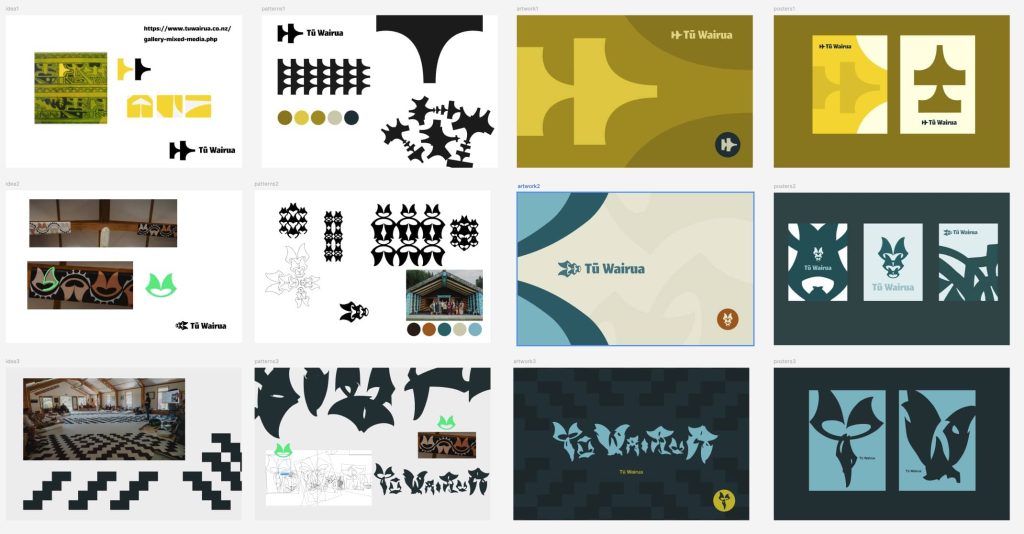


Tū Wairua design concepts
Traditional Māori healing practices
The website’s content was carefully organised using custom post types, and the final design was refined through multiple iterations. For the logo, I incorporated a dynamic 3D cross generated using Spline, an online 3D tool. I was drawn to its visual appeal and tailored it to my needs by adjusting the rotation speed and colour palette. Initially, I didn’t intend any specific symbolic meaning.
The colours of identity were defined. Otherwise, I would have held back on the yellow because I think it’s too saturated and unpleasant to the eye. Of course, the client’s needs come first, so I kept the strong yellow and brought in the green as a second colour to address this oversaturation.
However, a volunteer asked about the spinning cross, and during my explanation, the connection to the Red Cross became apparent. It was a complete coincidence, but the association with aid and support resonated deeply with the project’s mission to [state project mission]. While unintentional, the resemblance sparked a meaningful connection to the idea of aid and support. It was a surprising and powerful example of how symbols can acquire meaning through interpretation.”
I also added this green to the main 3D spinner to tip the balance back somewhere.


Thanks to Zephyr Wind for our new website!
Tamas was a charm to work with. He provided clear instructions at every stage of the process and was very responsive to our requests and unique needs regarding the website. His understanding of the WordPress system and what options we had for improving our client-facing resources was impressive.
The software he designed for editing the website was very straightforward, even for a technologically challenged person like myself. I’m impressed with how quickly he turned around a full rebuild of the site, and we couldn’t be happier with the results.


